Upgrading Free to Paid
Refined the upgrade flow iteratively, enhancing the buyer experience, simplifying pricing, and driving growth.
Overview
The Plan overview and checkout pages are critical points in a buyer's journey. Once organizations have run out of credits on the free plan, they must decide whether to limit their usage in perpetuity, upgrade, or churn in favor of a competitor. This case study examines an iterative process to refine the upgrade flow from free to paid, focusing on improving the buyer experience and simplifying the pricing model to achieve internal growth goals.
Challenges
• The pricing model takes multiple factors into consideration (e.g. configured resources, user seats per month, number of builds) and is based on a credits model that users reported as difficult to understand. This created a conversion barrier, resulted in users underbuying credits, and led to auto refills, billing frustrations, and revenue lost to underbuying.
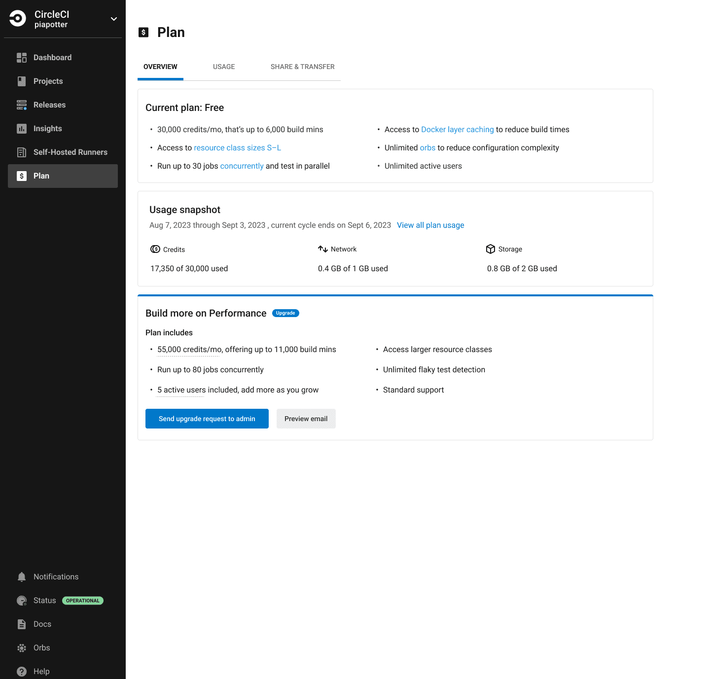
• The current UI did not convey the features of the user's current subscription or the benefits of upgrading.
• The current UI did not offer non-admin users a path forward to initiate an upgrade.
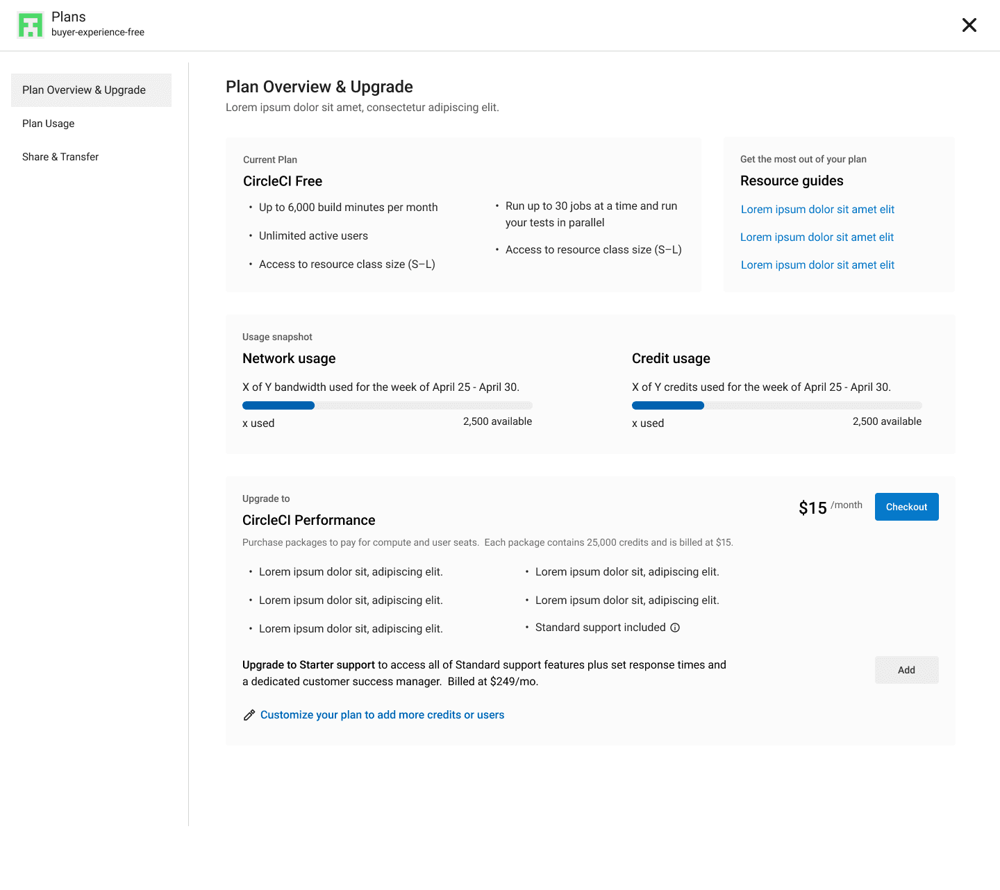
Starting state
Objectives
• Simplify the pricing model.
• Ensure users purchase the correct amount of credits.
• Create a consistent experience.
• Improve responsiveness.
• Unlock growth opportunities by enabling experimentation and creating new revenue streams.
Success Metrics
The objectives of this effort were necessary to achieve; however, results would be difficult to measure due to the flow's placement in the conversion funnel. For that reason, I leaned on research and usability testing to guide this initiative and eliminate obvious failure points. That said, we monitored the following:
• Primary success metric: conversion rate of out-of-credit organizations
• Secondary success metrics: traffic to the plan overview page and time spent
The Process & Research
For brevity, this case study focuses on the most significant round of changes to the plan overview page.
These improvements targeted the upgrade flow end-to-end, refining the cost calculator’s functionality and purpose while redesigning the plan overview and checkout pages to give users a clearer understanding of their plan, usage, and upgrade options.
I began the research process by analyzing data from previous user interviews, feedback, experiments, and analytics tools like Hotjar and Amplitude. Realizing that significant changes required more data, I developed a research plan and collaborated with a researcher to recruit users from our target audience.
Research method: 60-minute user interviews
The ideal participant: GitHub organization admins responsible for recommending CI tools at companies willing to invest in them, especially those who introduced CircleCI to their organization
Sample size: 9 current users
The theme: Understanding why people choose to pay for the Performance Plan.
After concluding the interviews, I synthesized my findings and presented them to the Product and Engineering teams. The team and I then categorized these insights to decide what to address in the next iteration and what to incorporate into our future vision.
Key Insights
• Users value the ability to evaluate our platform through the free plan.
• Users reported confusion about the pricing model and what they were being charged for.
• Running out of credits is the primary driver for conversion to paid plans.
• Advanced users manually calculate potential costs and necessary credits by examining their historical usage and cross-referencing the compute options cost table.
• Most users were unaware of the features included in their plan due to poor communication, not a lack of interest.
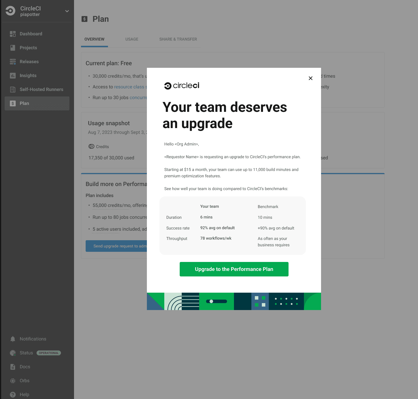
Guided by these findings, I iterated and incorporated feedback from the buyer experience and design teams. Considering design, business, and technical constraints, I finalized a prototype for usability testing.
Few explorations
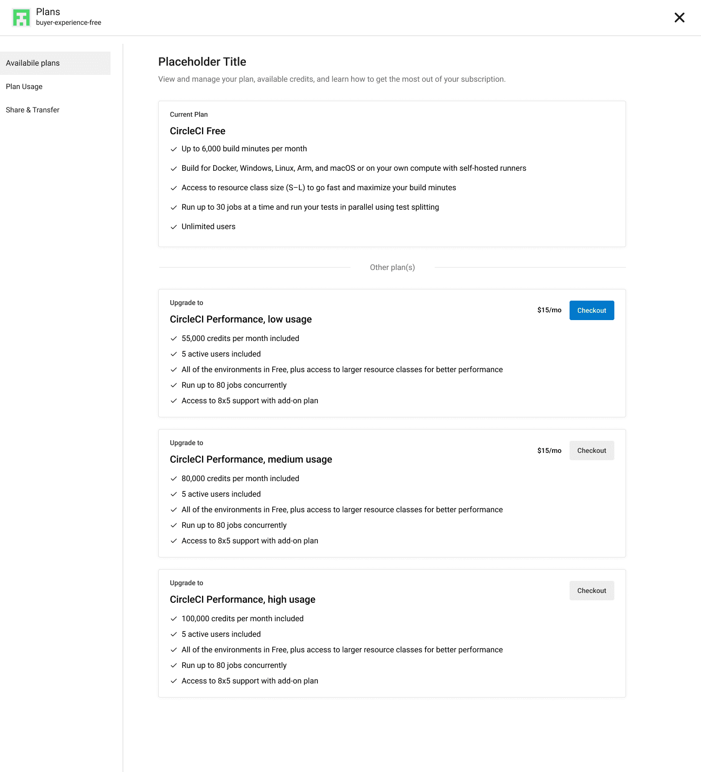
Design decisions made:
• Communicated plan features: Clearly outlined the features available to organizations on both Free and Performance plans.
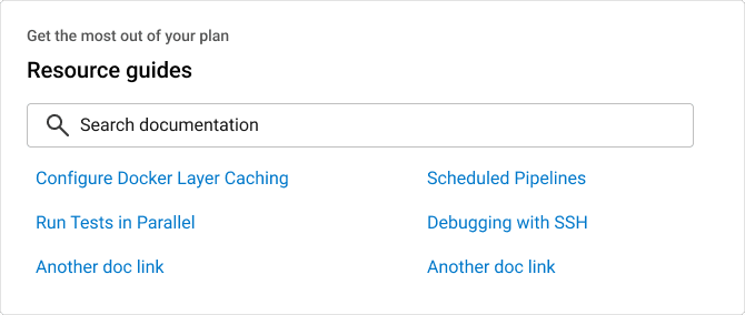
• Introduced a resource guide: Added a guide highlighting top-valued features and how to configure them. Notably, 50% of users who clicked on a guide adopted that feature.
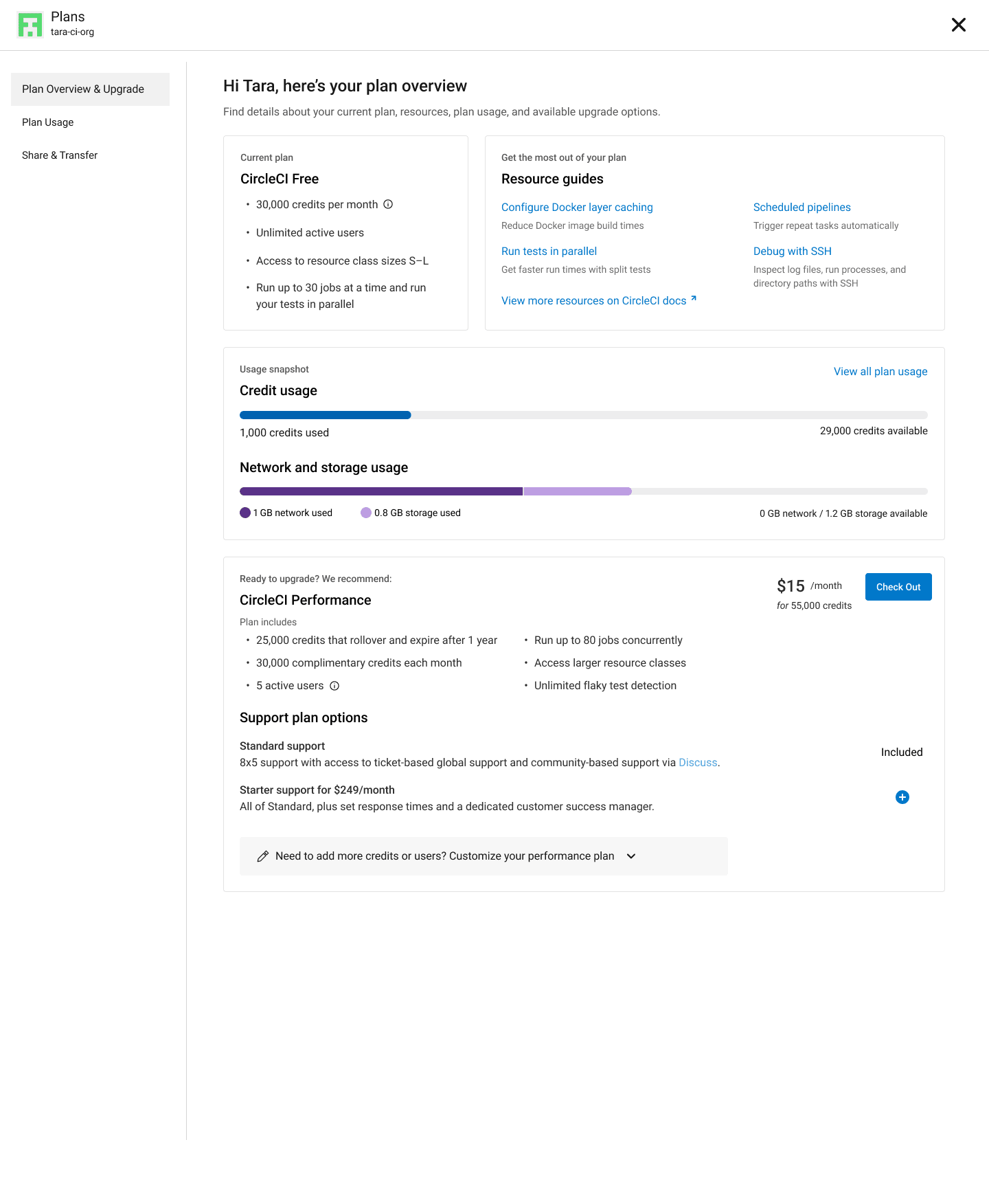
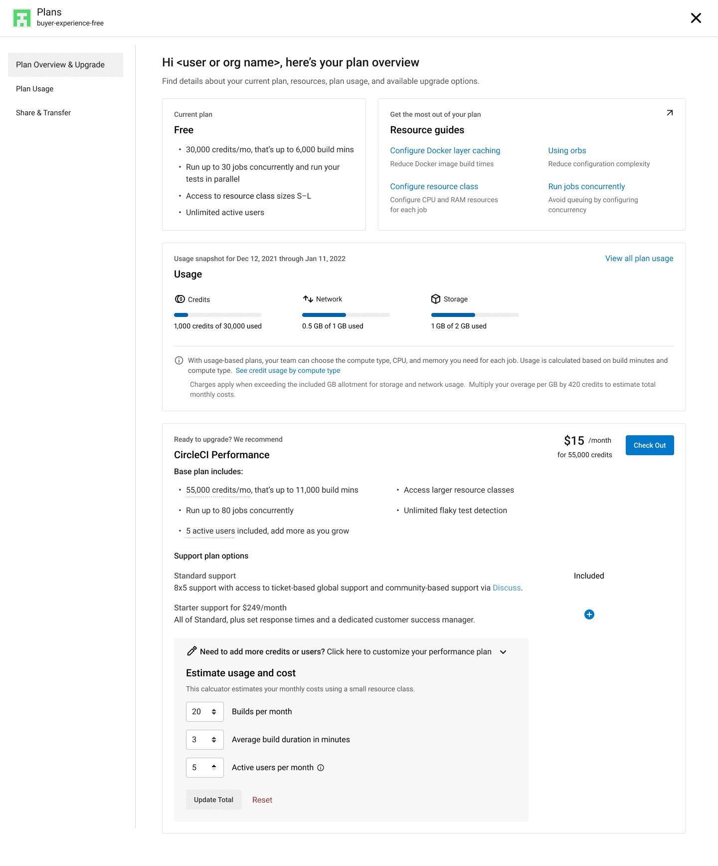
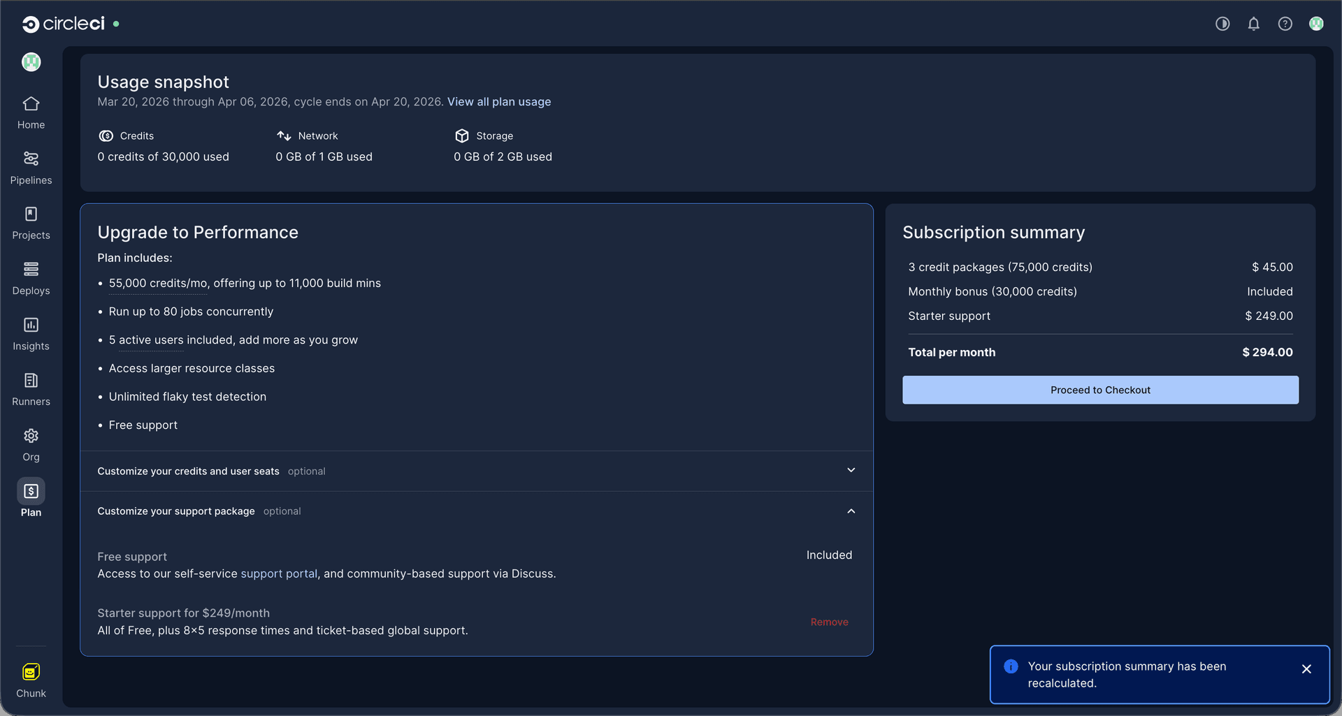
• Provided a usage snapshot: Improved visibility into credit consumption through the usage snapshot.
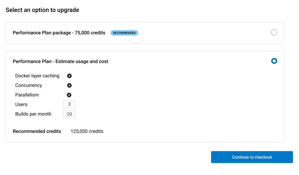
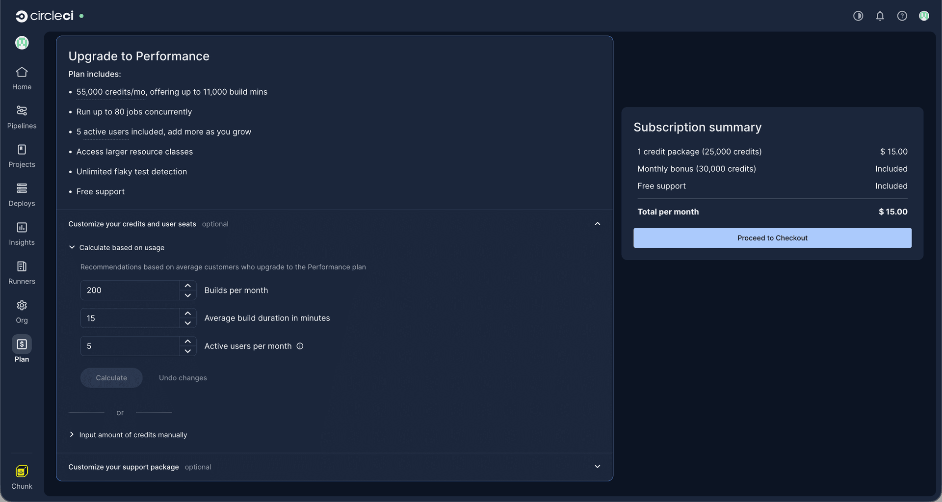
• Optimized the upgrade flow: Recognizing that most users check out with the base $15 plan, we prioritized express checkout to reduce cognitive load. To accommodate advanced users, I introduced a new cost calculator that accurately projects the necessary credits based on familiar metrics and, when available, is pre-populated with their historical usage.
• Streamlined the checkout UI: Focused the checkout interface on the core jobs-to-be-done: reviewing the subscription summary and entering payment information. The goal was to reduce the drop-off rate at this critical point in the flow.
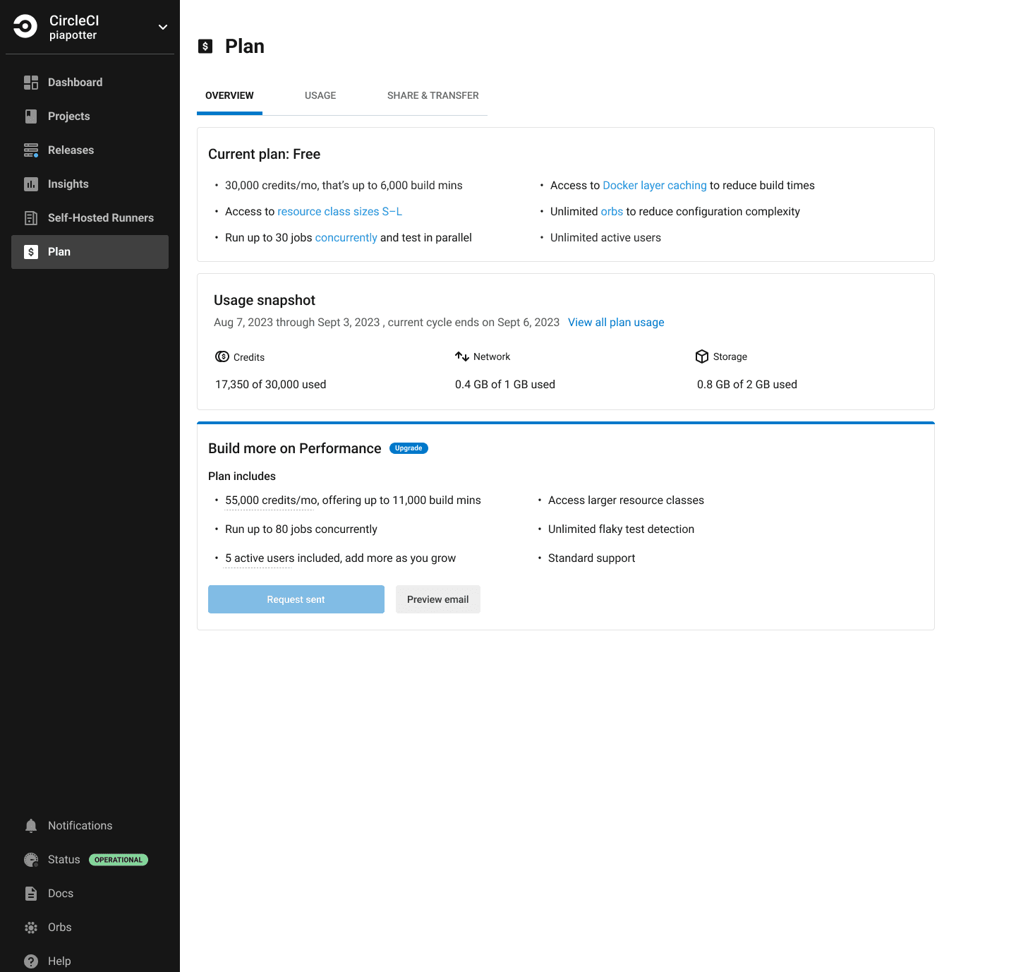
What I brought into usability testing after refining
Testing and Outcome
The usability test was unmoderated via UserZoom, where participants were prompted to complete tasks while thinking aloud. After manually synthesizing the test results, I made the following changes:
On the Plan Overview page
• Resolved readability issues with the usage snapshot by separating the network and storage trackers and adding color-coded consumption indicators (low, medium, high) from Compass, our design system.
• Improved copy and applied a different treatment for info tips, utilizing a style that had proven successful elsewhere in the application.
• Included the resource class used to project costs in the calculator.
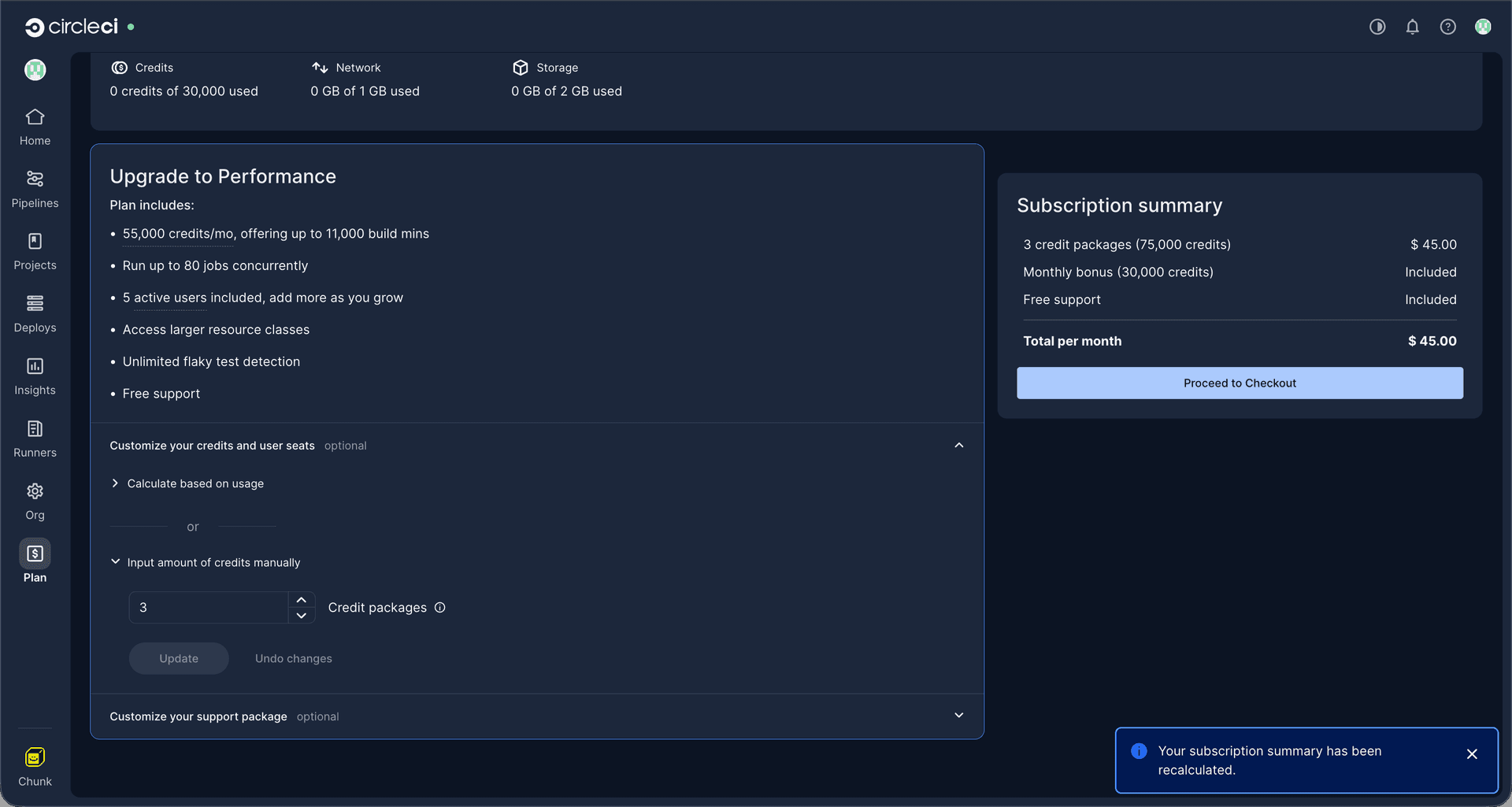
• Employed toast notifications to provide users with visual feedback when they made changes to their subscription selection.
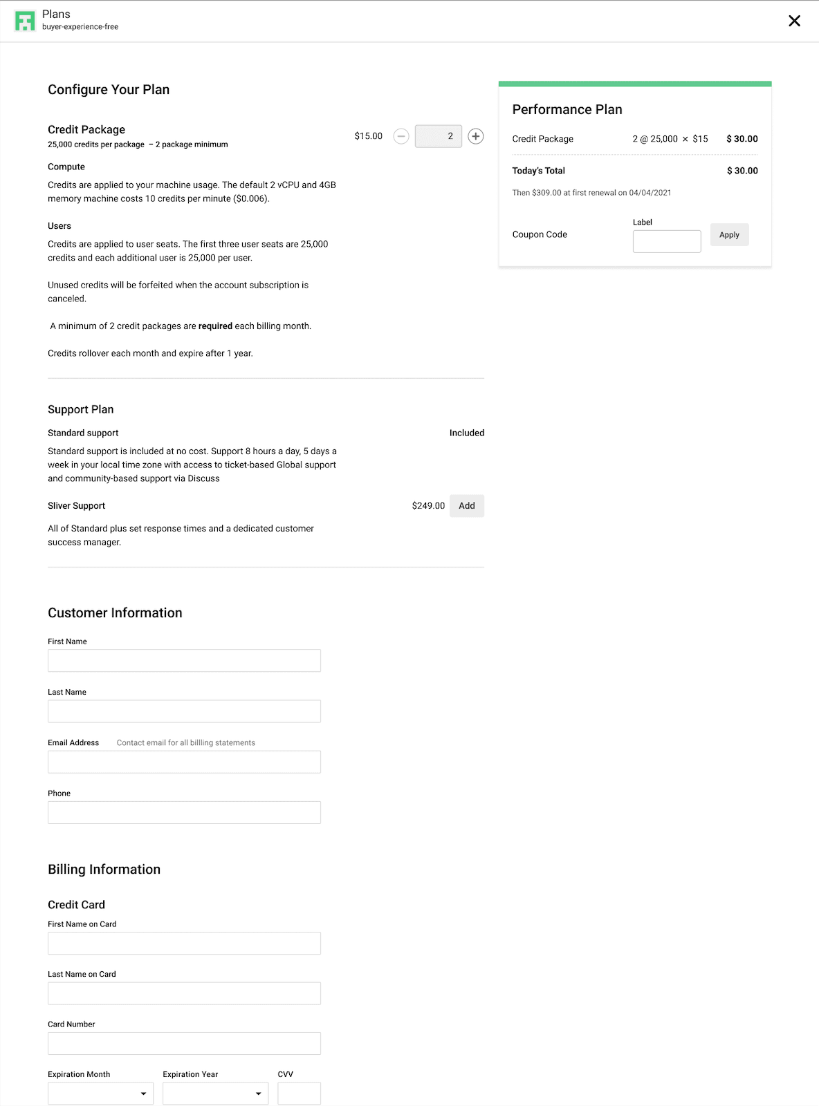
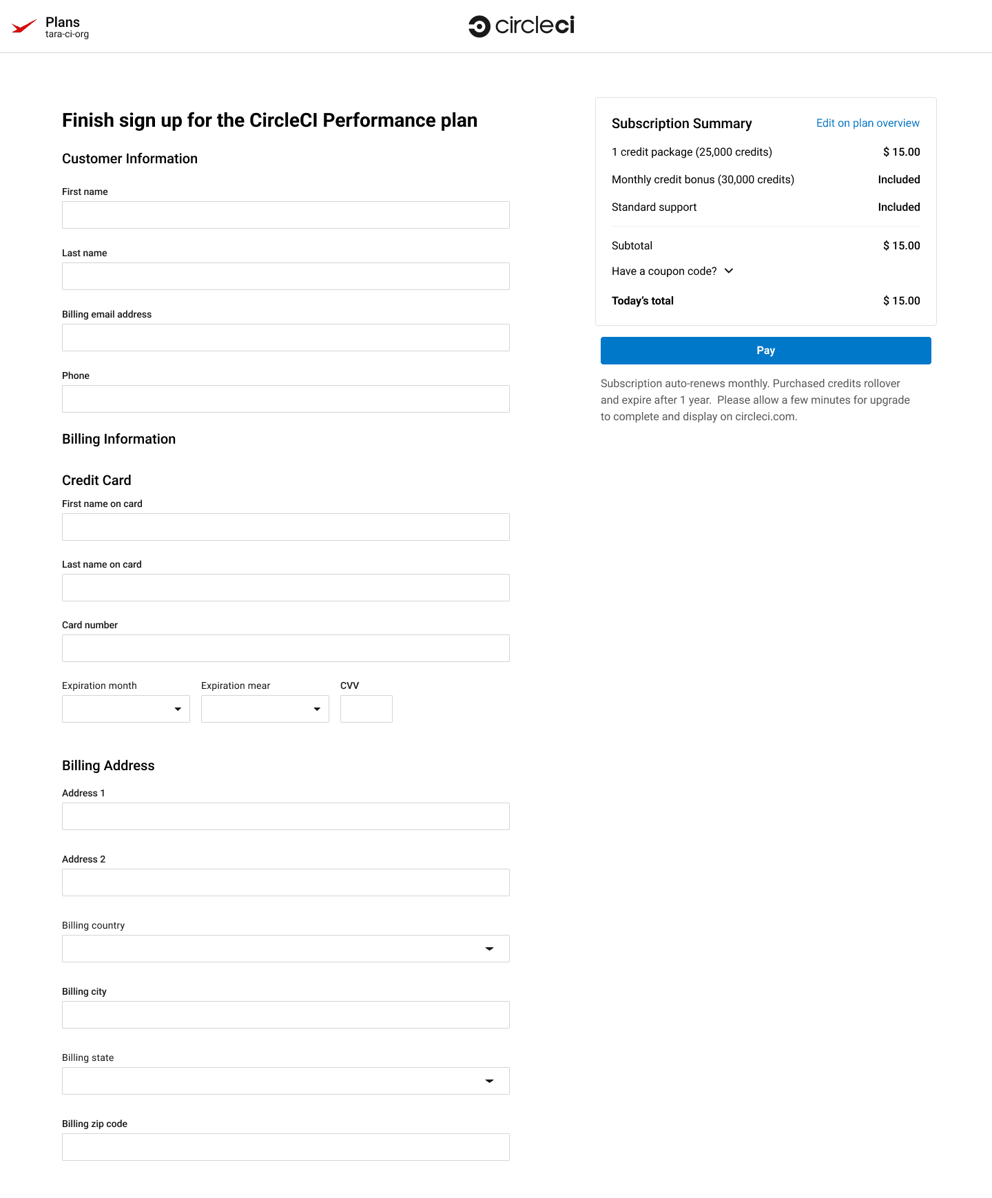
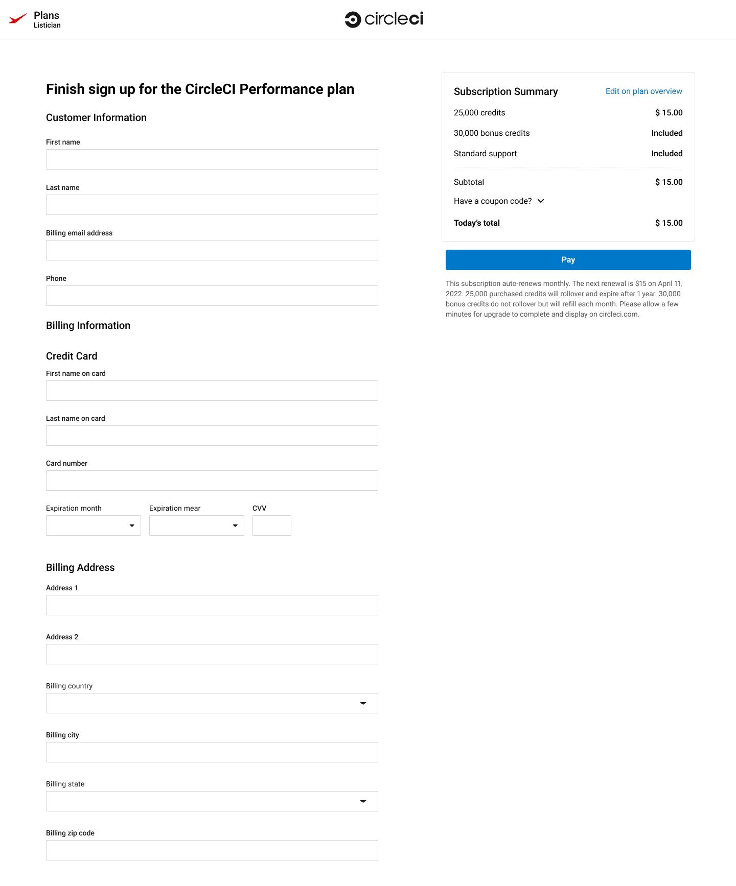
On the Checkout page
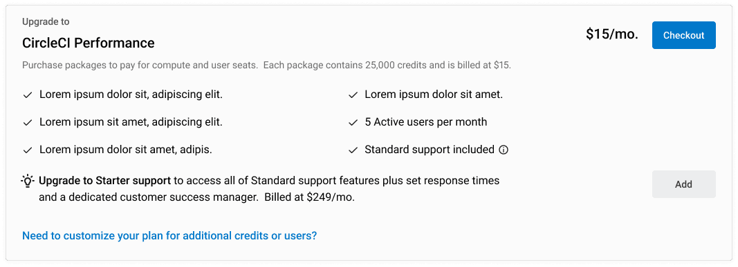
• Refined the subscription summary by removing package terminology and focusing on the amount of credits and their cost.
• Included information on billing cycle dates and how purchased versus bonus credits are consumed.
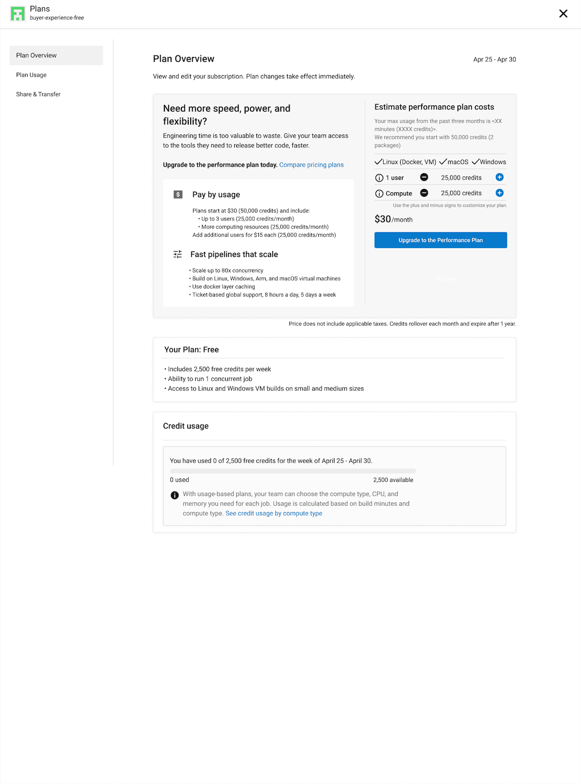
First release
Limitations
• The Plan tab was housed in a modal detached from the inner application's global navigation and design. This created design and technical limitations.
• The pricing model changed shortly after my research concluded; however, the findings remained valid.
• Technical and business constraints limited the cost calculator's functionality. My goal was to expand it in a future iteration to accurately reflect the cost of configuring different features and resource classes.
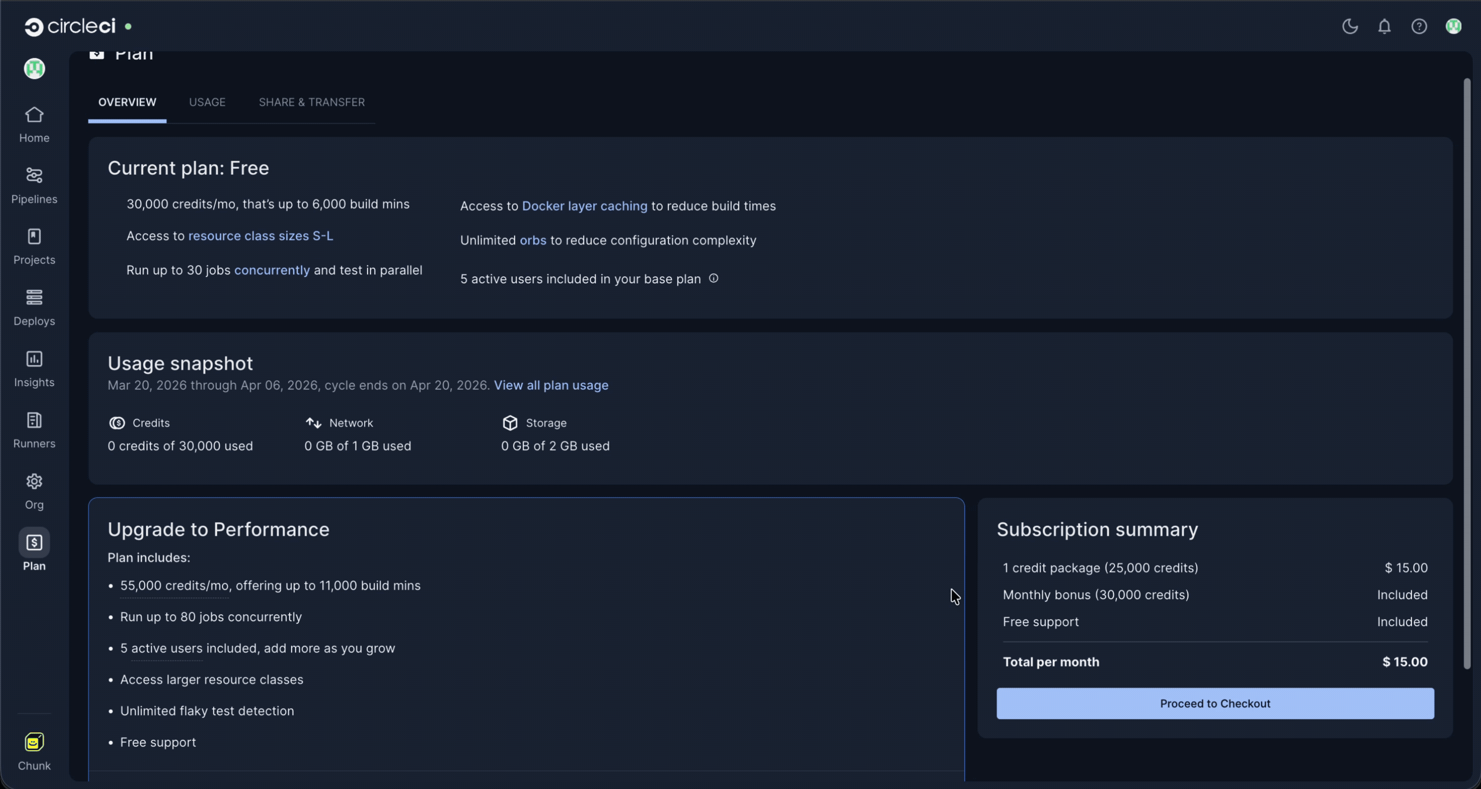
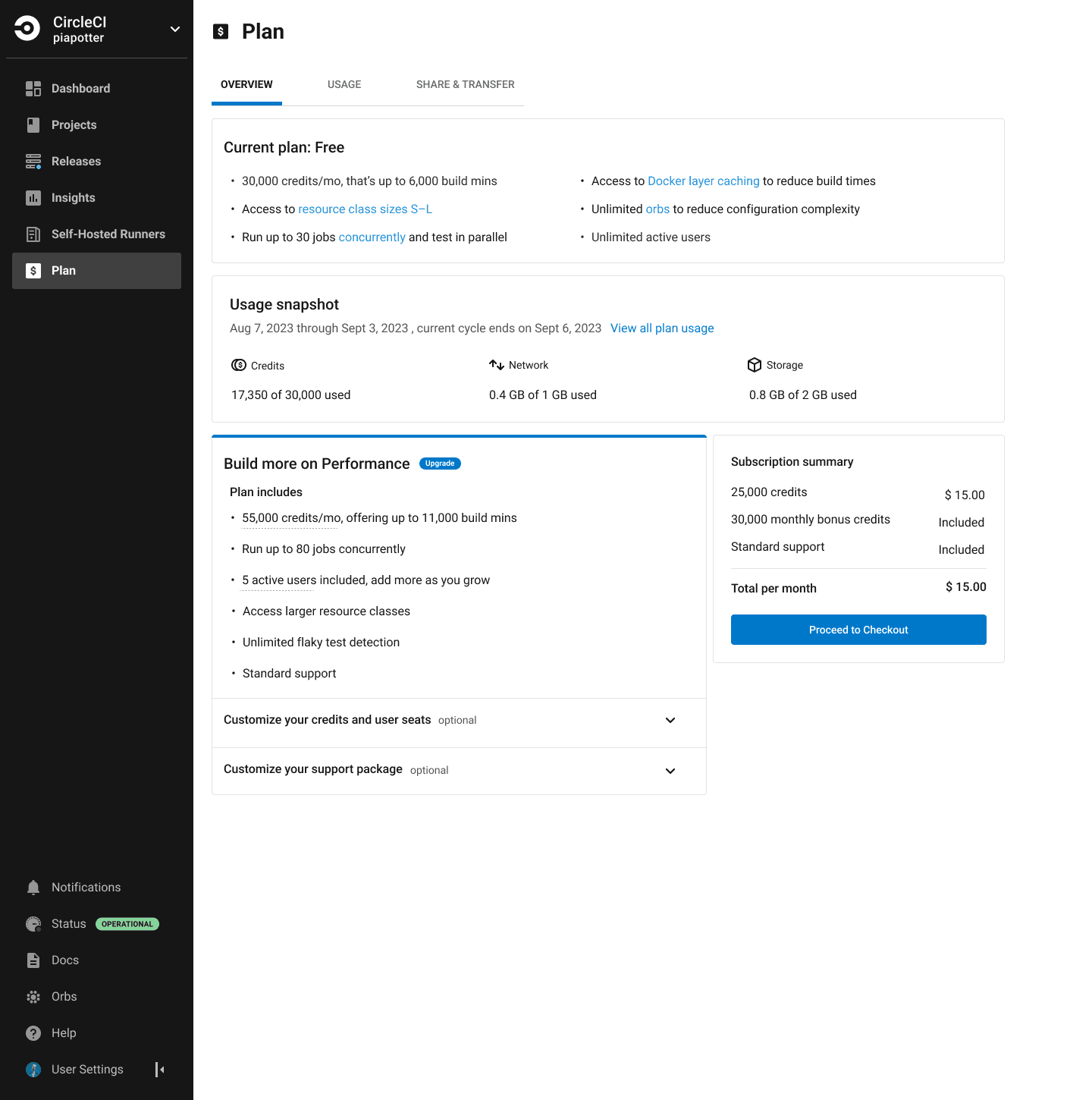
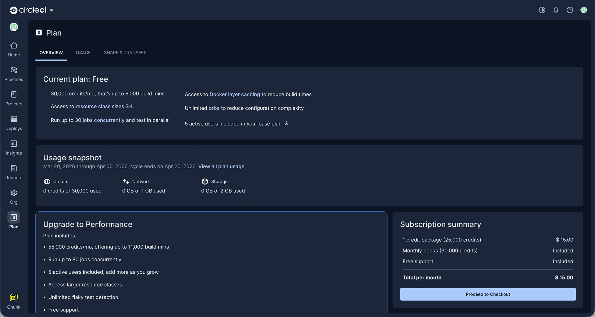
Solution, Part 2
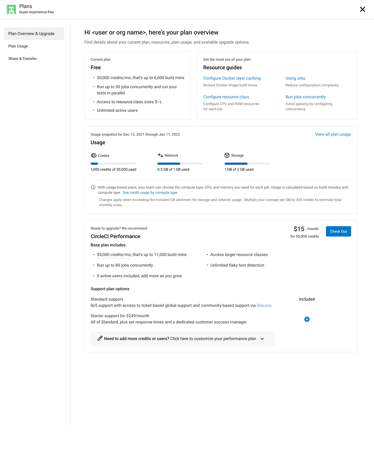
The current iteration of the plan overview is part of the redesigned Plan UI. This final iteration was informed by user interviews, feedback, and other sources we've monitored since the initial release.
Key improvements for users:
• Improved overall copy and information architecture for ease of use and readability.
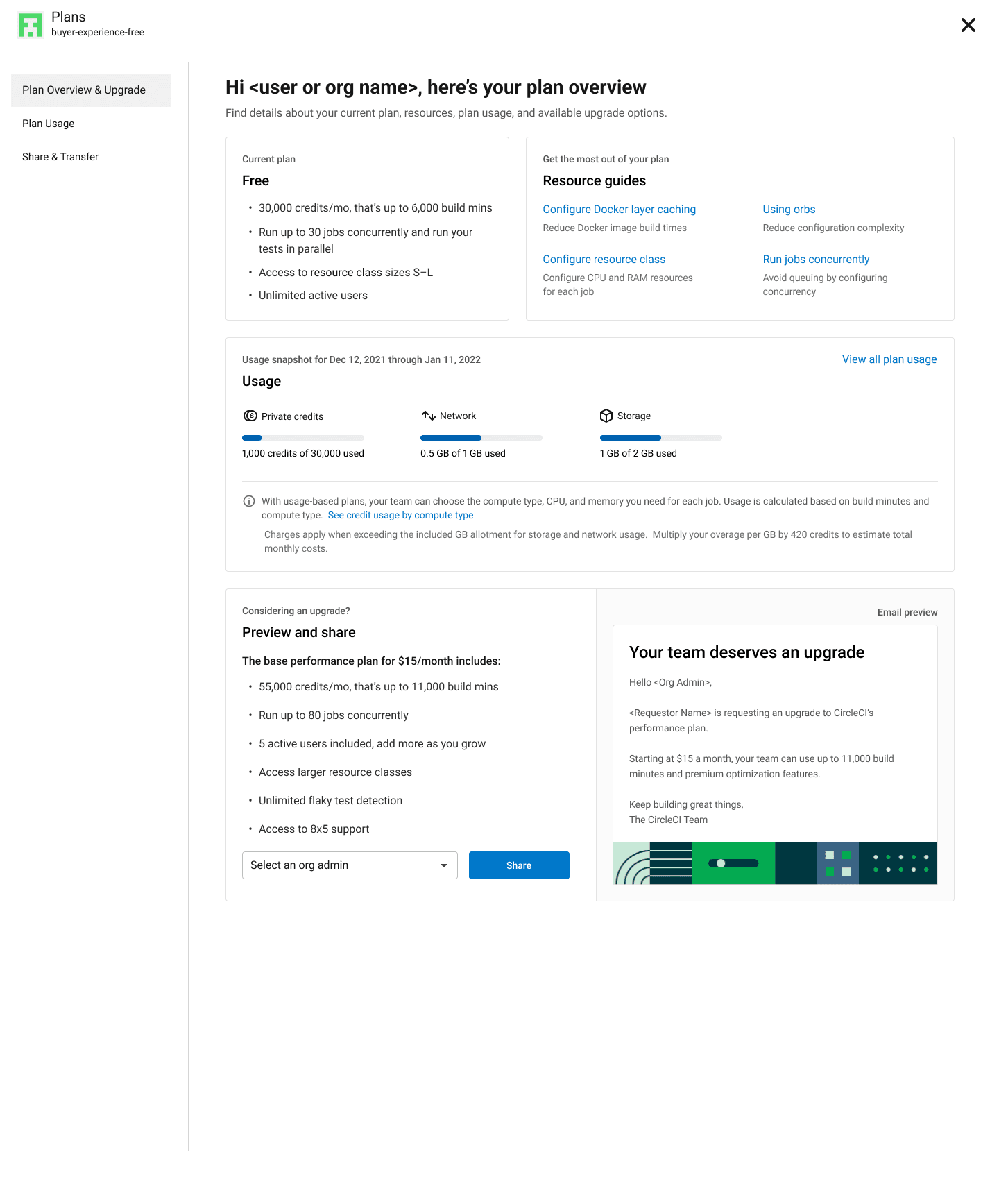
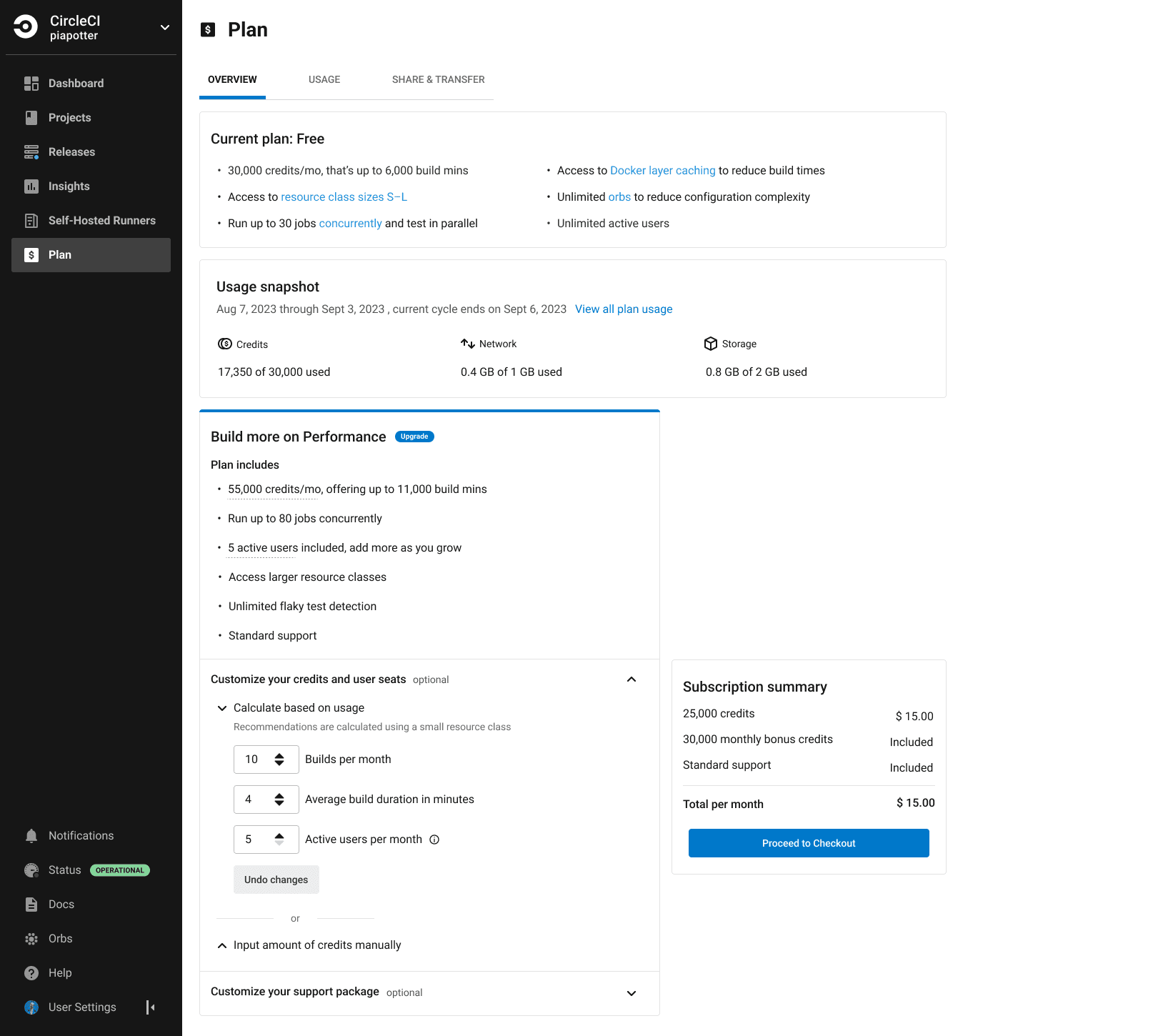
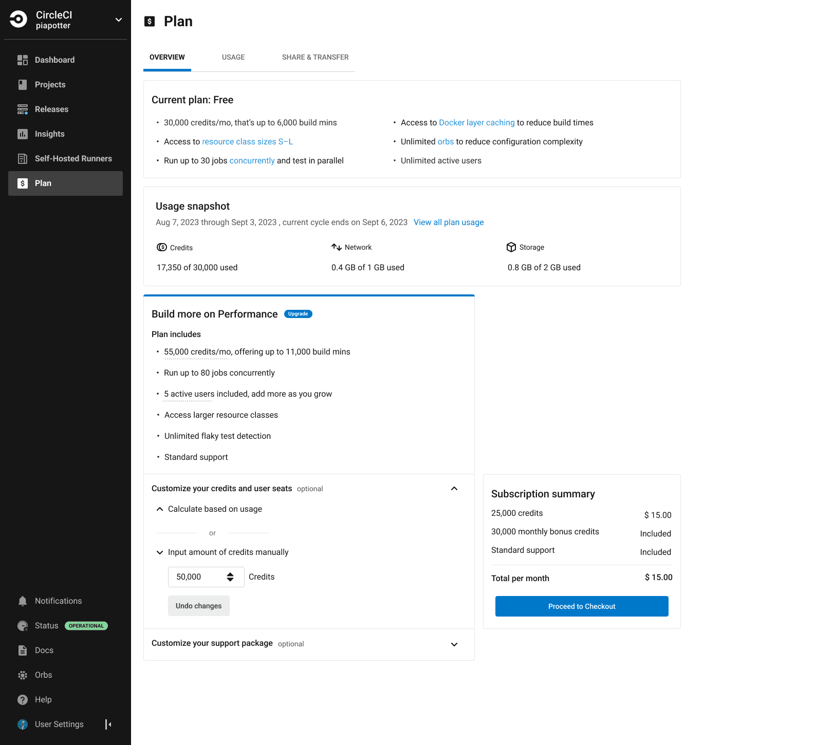
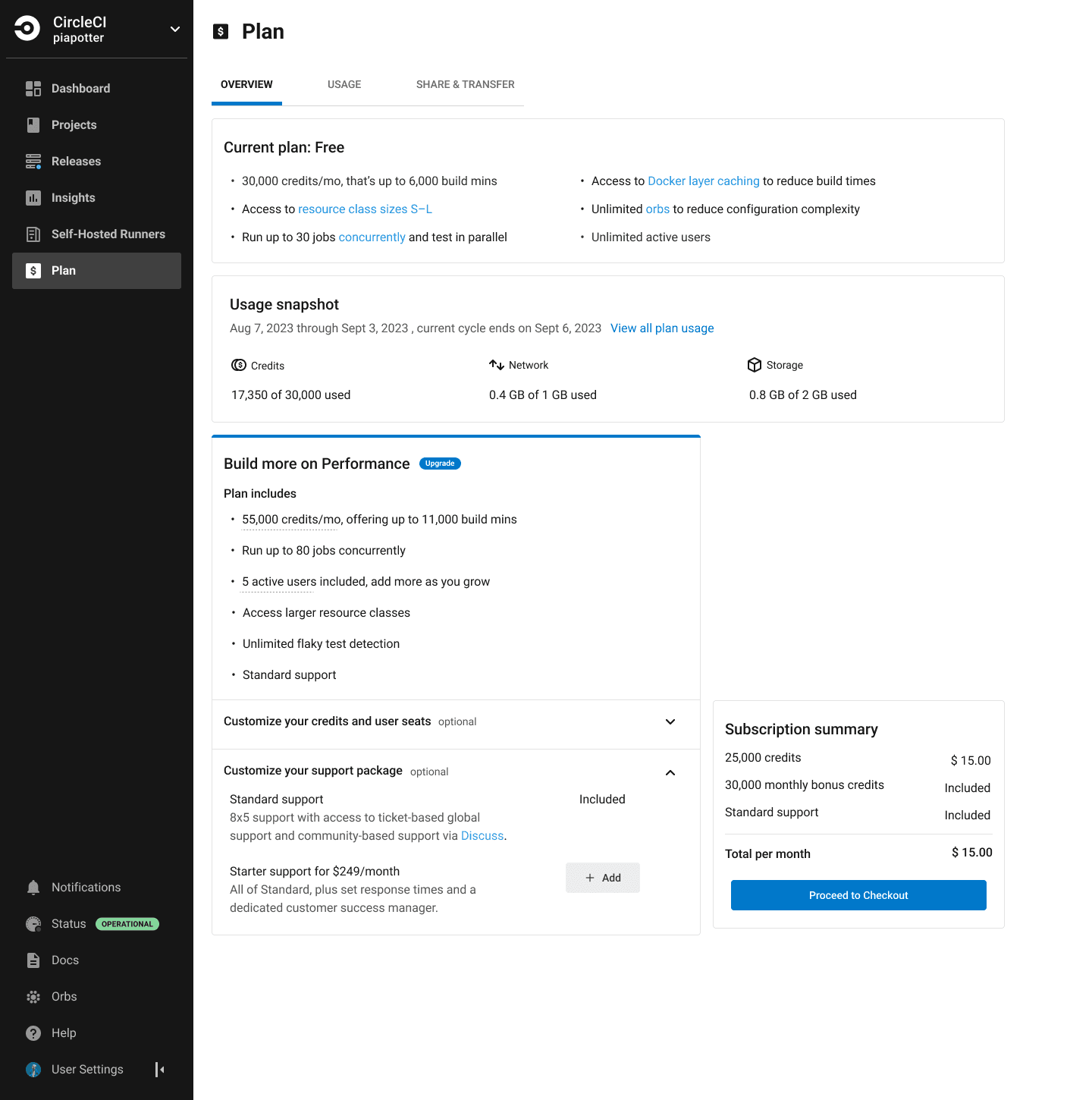
• Optimized the default upgrade flow: Data showed that most buyers opt for the base $15 plan, indicating little interest in alternative support packages. To reduce cognitive load and prevent drop-offs, I redesigned the flow so that custom credit and support package selections are collapsed by default but remain easily accessible to advanced users.
• Introduced the option to manually input credit amounts: In response to requests from both external and internal users, I added the ability to manually input a credit amount. The field is pre-populated based on their historical usage, when available, for convenience.
• Introduced micro-interactions to clarify changes and provide visual feedback.
• Integrated the subscription summary component into the Plan overview page to enhance consistency, clarity, and confidence throughout the upgrade flow.
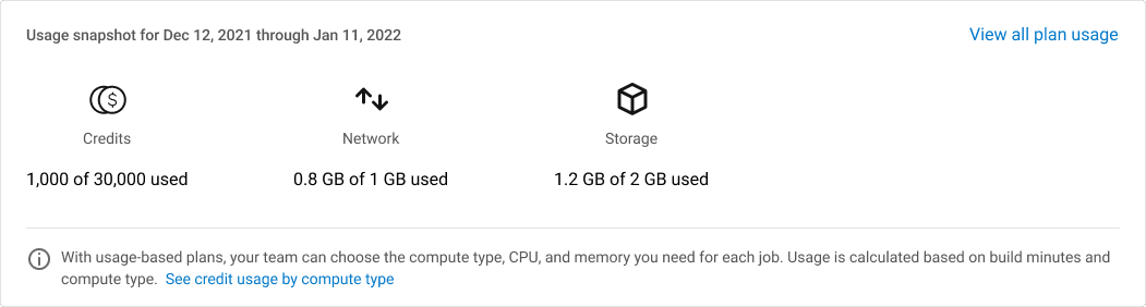
• Updated the usage snapshot to support paid plans. Since paid plans auto-refill when an organization runs out of credits—meaning there is no fixed amount of available credits—the snapshot reflects this behavior.
Second release
Impact
The impact of this effort cannot be precisely quantified. However, we monitored predefined success metrics to ensure that conversion and revenue were not negatively affected. The true value of this redesign is reflected in the enhanced cohesion, consistency, and unlocked growth opportunities. The insights gained from our research have also proved invaluable to our team and the broader CircleCI organization.
While the design system around it has since been updated, the core solution remains live on CircleCI today, speaking to its longevity.
Let's work together
Available for new opportunities. If you need a designer who moves fast and owns the work end-to-end, I'd like to hear what you're working on.